It’s easy to spot the difference between a professionally built website and one built by an entrepreneur out of necessity. One’s polished and the other is typically poor. One brings the viewer a sense of security, confidence and trust. The other leaves the viewer feeling unsure, uneasy and usually frustrated.
In a digital world, a website is one of your most important marketing assets. It’s your virtual handshake and a potential client’s first impression. Your website can and likely will separate you from competitors–one way or another–whether you realize it or not.
We asked our Web and Multimedia Specialist, Junice Savares, to describe the process of building a website and ultimately delivering a great user experience from start to finish. We’ll also show you a few recent examples.
Design
- Follow a content strategy and brand style guide
Every company has its own culture and personality. Web developers have the tools to bring those unique qualities to life. Following a content strategy and brand style guide helps web developers be more creatively innovative, while keeping the company’s goals and branding intact. Web developers apply design rules to give website visitors the best user experience.
Some generally good design rules to follow include simplicity, consistency, and visual hierarchy. Colour, type font and graphics are common elements used on every website, but balance is needed to maximize impact. With emphasis on good contrast, we strive for simplicity here at Dooley. We see simplicity as clean, concise and professional. We organize website elements starting with the most important to easily direct our website viewers, while keeping the experience enjoyable. Headings, subheads, and body font sizes should be consistent and readable all throughout.
The key is to make the experience user friendly, regardless of the viewer’s device.
2. Make the website responsive on all devices

Responsive web design means ensuring your website fits all sizes and types of screens. This provides the viewer innate comfort regardless of the device they’re using.
The majority of website viewers use mobile devices, so most web developers use a design process called “mobile first.”
Mobile first design starts by building a basic version of the website with the most integral functions and features. From the basic version of the website, developers progress toward a more advanced version of the website (for a tablet or desktop computer).
At Dooley, we use Webflow, a “no code” software platform that was made for designers to convert their visions to user-friendly sites. We moved away from the clunky and fussy open source WordPress platform in favour of Webflow because it offers rapid prototyping and superior design capabilities to build interactive and engaging sites. Webflow efficiently builds responsive websites and ensures the site’s compatibility with all devices (types of screens): cell phone vertical, cell phone horizontal, tablets and desktop computers.
3. Compress graphics and videos
Compressing design elements optimizes load speed for all viewers. We aim for the smallest file size possible to optimize load time on any internet speed, but without distorting any visuals. According to Google developers, “More than half of visits are abandoned if a mobile page takes over 3 seconds to load.”
To compress visuals, we focus on finding the correct dimension, format and size for the website. We use the software Adobe Creative Cloud to compress our graphics and videos such as Photoshop, Illustrator and Premiere Pro.
Content

1. Organize page structure
Once everything is compressed, we comb through the website copy to ensure an organized page structure. One of the best practices: follow a logical heading hierarchy to improve usability, web accessibility and SEO.
For example, the most important heading should be ranked as “<h1>” while the least is “<h6>”. The most important heading summarizes what the page is about, which can assist screen readers that use assistive technologies.
This can improve your website’s SEO because search engines usually highlight copy based on the tags web developers use to structure the site’s pages.
2. Proofread your copy
Assuming your copy is written, it’s time to proofread. We’ve already said it, but your website is your virtual handshake and your first impression with a potential client. You don’t want any typos or mistakes, as oversights look rushed and unprofessional. Put your best foot forward. If proofreading is an issue, hire a professional.
3. Testing and security
Testing is a very crucial part of web development. Websites, between all the buttons and copywriting, contain many links. We are thorough in making sure all links are working. We never direct viewers to a button or link that isn’t working, as it’s off-putting for the viewer and, again, could lead to lost eyes.
If your website has submission forms–the good ol’ “send us a message,” or “register by filling this out” form–we test them and make sure when viewers submit forms that the client is actually receiving those results.
We validate all form inputs to better direct users. If users filled out a form incorrectly–for example, if they forget to enter their postal code or email address–an error notification should tell them why the form cannot be submitted. You don’t want to slow down a user by having them troubleshoot your form.
Form validation also prevents any malicious activities. It helps filter out spam or hackers who are potentially trying to inject malicious codes within your server. We place a CAPTCHA test on all our forms. A CAPTCHA is a type of challenge–response test used in computing to determine whether or not the user is human.
But we don’t just protect the website’s viewer, we need to protect you, its owner, as well. No one likes spammy emails coming in, especially as we know many are also potentially dangerous phishing scams.
Additionally, we ensure the sites we manage offer up to date privacy and cookie policies.
We provide privacy policies to inform website users the personal information we are collecting and how we are using it. We also provide a cookie policy to identify all the cookies of our website and what is being tracked on the user-end for testing and advertising purposes.
While this notion doesn’t always sit well with people, almost all websites use cookies. Completely opting out isn’t an option anymore. Having cookies tracked and used for advertisements is the current reality if you’re using the internet.
But legally speaking, every website must inform its users. Once the user is informed about privacy and cookies, the choices exist to use the website anyway or decline/edit the privacy and cookie policy request options.
Launch
1. Add Google web services

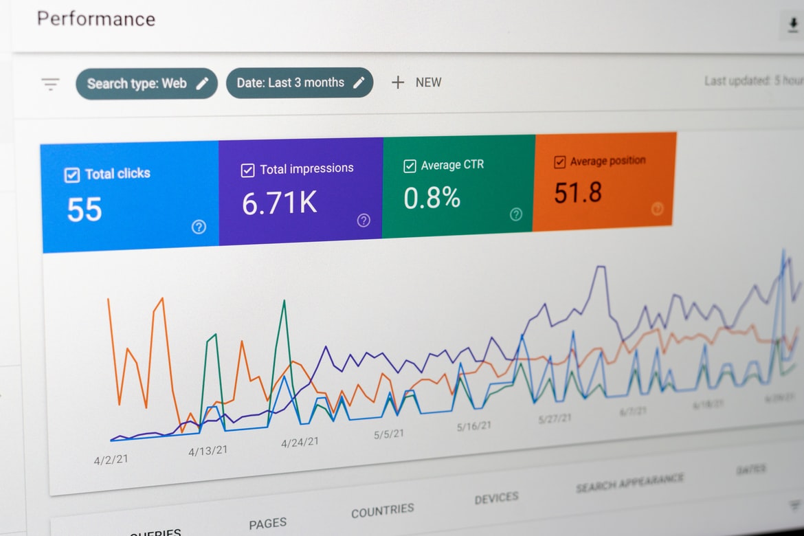
At Dooley, we use several Google web services to track performance, troubleshoot errors and improve web experience. Google Search Console is one of the fantastic tools we use to ensure your website is properly maintained. It tracks and notifies any server, responsiveness, security and indexing issues.
To efficiently get your website on search engines, we upload your website’s sitemap on Google Search Console. This will help bots to simultaneously crawl on your site to improve SEO and avoid any other technical issues.
2. Redirect links
Broken links can affect your credibility, conversions and SEO page rankings. We want to make sure all previous links are being redirected to new paths. For example, if you come to us with an old website for renovation or facelift, we ensure the old website’s URLs will redirect to a relevant page on your new website to keep the web traffic steady. If you’re launching a brand new website, this isn’t a concern.
3. Connect your custom domain
Webflow has made it easy to connect your custom domain to Webflow hosting. After providing your custom domain (example: dooleypr.com), Webflow will automatically give you records to update on your domain’s DNS (example: GoDaddy). Once the records match on Webflow’s host to your domain’s DNS, a communication channel is verified.
The easiest and best part of launch is clicking on the button “Publish” and the website is finally live!
Recent website examples
Dooley PR & Marketing has no shortage of satisfied clients.
In regards to website builds, we have a few recent examples we’re very proud of including:
For more information about website builds or a consultation, visit us at https://www.dooleypr.com/.


