Typography is powerful. It’s a key element of brand design, and it conveys so much information—not just through the words themselves, but through style and expression.
Language evolves with culture, and typography is a means of expressing our language. While our vocabularies and dialects grow and change, becoming more “lit,” “based,” and “yassified” with time, our font styles evolve, too.
When you think of styles shifting with culture, we often imagine things like fashion trends. Bellbottoms, daisy textiles, and tie-dye instantly bring to mind the flower power, peace and love era of the late 1960s and 1970s. This style reflected a period of cultural rebellion, anti-war, and anti-capitalist movements.
Typography is no different. Just like fashion, music, and colloquial slang, typography is an expressive, ever-changing medium that reflects the values and cultures of contemporary society. When you look back at popular font styles across different eras, it’s something of a history lesson—one that has captivated our graphic designer Sarah Elliott.
Brand marketing and design are all about messaging—what are we trying to convey to our audiences? This is why typography is such a powerful marketing tool. People don’t just absorb the language itself—whether or not they realize it, they’re also absorbing the message your font style is projecting.
Congratulations, It’s a Font: The Birth of Typography
Over two thousand years ago, the ancient Romans developed Roman square capitals, known as Capitalis Monumentalis—essentially, an alphabet starter pack for the written language we use today. From there came the Carolingian minuscule lowercase ovals with ascenders (d,b,l) and descenders (y,p,q).
As society became more literate and the demand for printed reading materials increased, typography became more condensed to allow for faster writing, and more words fit within a page. Blackletter was born—a medieval form of handwriting using broad-nibbed pens to create heavy, angular letter shapes and condensed counters— the “eyes” you see in letters like ‘e’ and ‘o.’
Then, when Johannes Gutenberg invented the printing press, this catapulted our standard written typefaces into the mainstream. A set alphabet of limited characters easily arranged into lines of text and printed onto pages made the production of literature far easier to produce and reproduce—unlike many Eastern written languages containing millions of complicated glyph combinations. In the 1450s, the Gutenberg bible—the world’s first printed book—used a typeface that allowed for even more characters and, in turn, more information on every page.
Typography and Advertising
The Industrial Revolution of the 19th century saw improvements to the printing press and a massive increase in commerce. The demand for engaging advertising that grabbed people’s attention paved the way for bold, stylized fonts and crisp sans-serif typefaces with consistent line sizes and fewer flourishes.
Fonts started to become ubiquitous with brands. Coca-Cola first introduced their ribbon-like cursive in 1887, and after some minor tweaks and redesigns, the 1941 version with white font on a red label remains central to the brand’s identity.
With so many tools with which to experiment and mass-produce written typefaces, typography emerged as a major art form—one that people interact with daily. Clear trends in font styles became identifiable across decades, just like fashion trends.
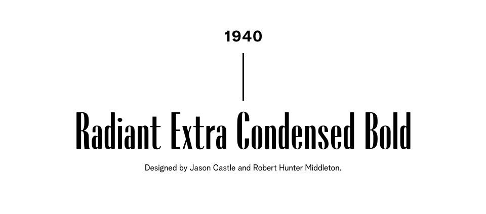
Extra-condensed bolded fonts of the 1940s bring to mind vintage advertisements with Donna Reed-esque ladies in their spotless, pastel-coloured American Dream homes—a snapshot of cultural ideals post-WWII.
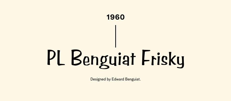
Whimsical, cartoonishly cute 1960s texts remind us of hand-drawn title text for some of the earliest TV sitcoms like Bewitched and The Jetsons when televisions first became accessible technology for modern households.
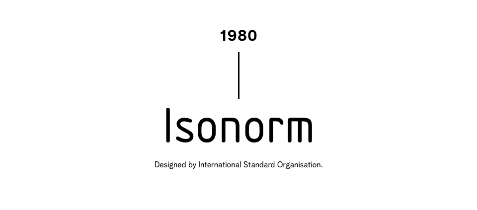
Digital 1980s texts harken back to early computer technology when Macintosh computers and Atari gaming systems were on the rise, along with electronic New Wave music and eccentric hairstyle choices that make our parents blush with embarrassment. Don’t worry, Mom—the mullet totally made a comeback this year!
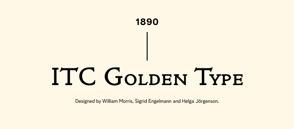
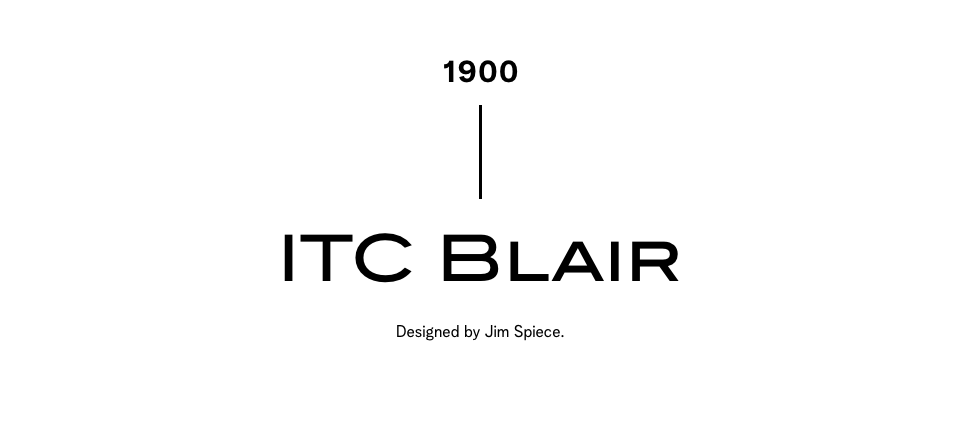
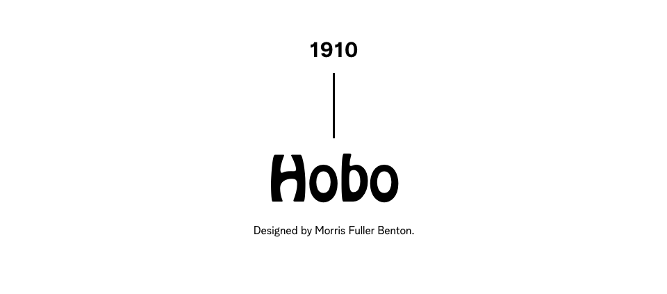
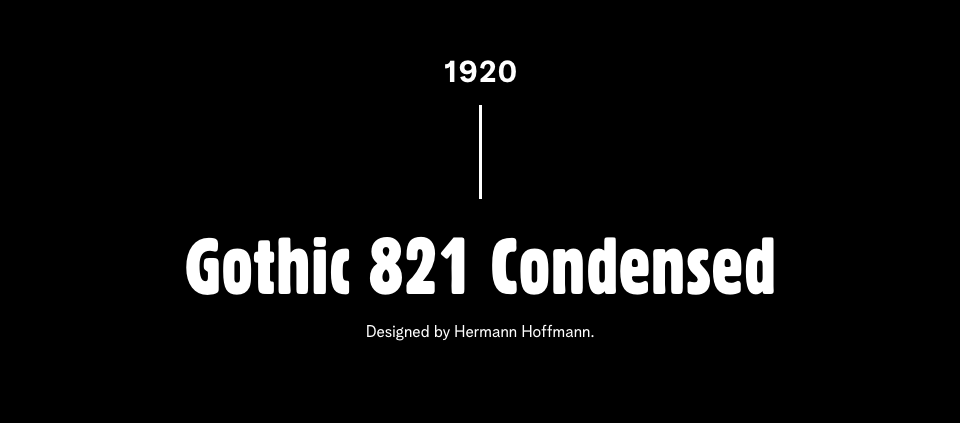
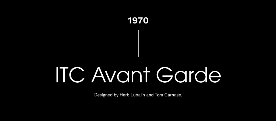
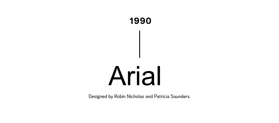
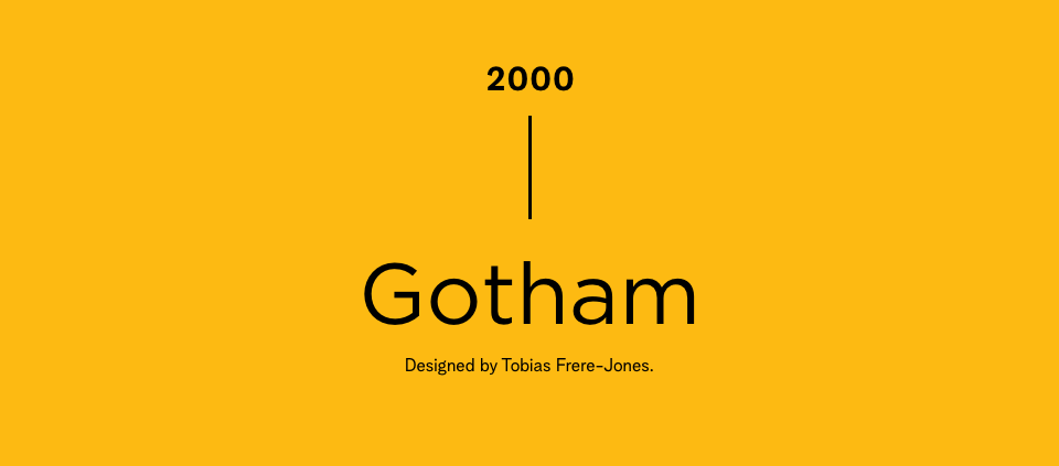
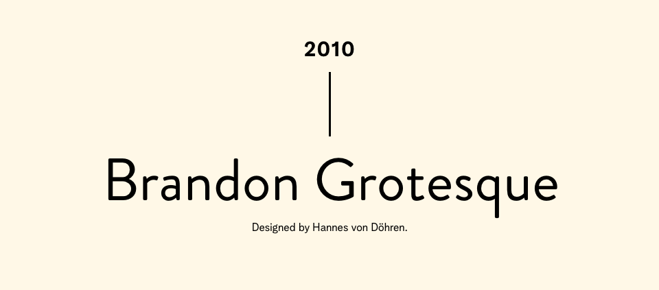
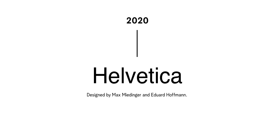
Browsing through visual timelines of trending fonts across history is a thoroughly satisfying experience. Sarah couldn’t help but make her own!
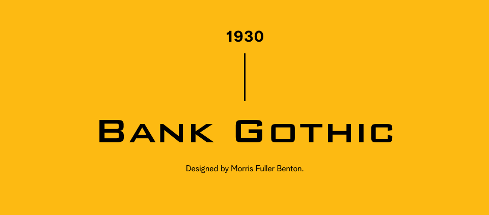
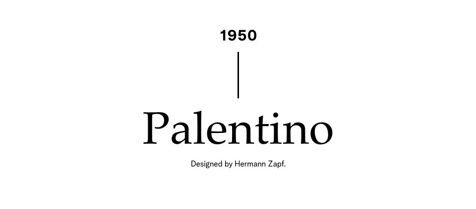
Take a look at these popular typefaces from the past 130 years and note the visual associations you make in your mind when you read them. You might be surprised at how evocative they are, yet so seemingly simple.
Do you have a favourite type? (Please, don’t say Comic Sans). The UpHouse brand uses fonts from the Albra (serif) and Albra Grotesk (sans-serif) font families—high-contrast, easy-to-read typefaces with plenty of personality—perfect for meeting our accessibility standards while still bringing the necessary attitude and flair.
Explore some of the gorgeous typefaces our designer Sarah has incorporated into brand identities! Her fascination with typography has made for some seriously stunning design work, and we’re proud to show it off.

