Brand refreshes dramatically impact how consumers and prospective employees view your organization. It can generate newfound interest, add contemporary flair, and help you stand out from competitors.
That being said, a total brand makeover can be a daunting and potentially risky venture for established companies. After all, a well-known logo has equity and recognition—why would you want to jeopardize that? Well, if you’re familiar with the UpHouse team, we love when clients are willing to take a risk. The rewards are often far greater than anticipated!
We sat down with Brenlee Coates, our Creative and Marketing Director, and Sheena Case, our Art Director, to discuss when companies can most benefit from a brand refresh.

1. Your Brand Doesn’t Reflect Your Current Values
Everyone loves a good story. From an advertising standpoint, a strong brand story builds a feeling of connection between your company and the consumer. If you’ve overcome a challenge, people want to hear about it! It shows what you’re capable of achieving and illustrates your purpose and values.
If your brand story starts with “Since 1965…”, that’s a red flag. Consumers want to know what drives what you do now. Every business overcame challenges during the pandemic based on prioritizing what was most important to them, so that’s a great place to start if you’re looking for source material that’s new and relevant.
Of course, consumers aren’t your only audience, you’re also speaking to potential employees. Recruiting quality talent is difficult and expensive! If your brand accurately represents what you stand for, you’ll have a much better time attracting employees who are a good fit.
A strong brand is a way to celebrate your culture. Make sure any messaging about your brand is accurate, compelling and exciting. – Brenlee Coates
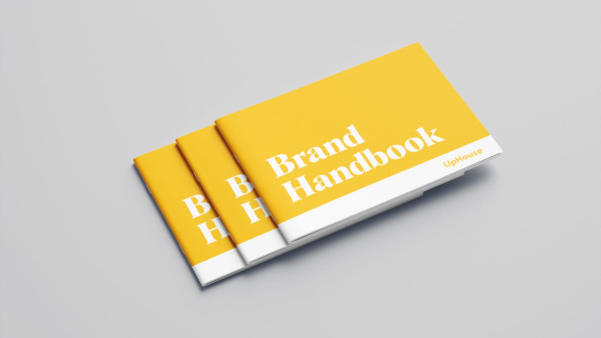
If you don’t have an up-to-date employee handbook, make one! It’s a terrific opportunity to think critically about what you’re all about, why you do what you do, and what makes your brand different from the rest. From there, you can make a more accurate assessment of whether your brand identity reflects the true nature of your company.
2. Your Brand is Not Inclusive and Accessible
Is your brand getting in the way of progress?
Let’s say we were a 100-year-old plumbing company called The UpHouse Brothers. Perhaps we want to diversify our team and encourage more women to work for us! Well, “Brothers” implies a male-dominated environment, and it might not be attractive to prospective employees who value inclusivity.
Examine whether your brand reflects industry trends and effectively communicates your capabilities. Consumers have higher standards for corporate responsibility and social purpose, and you don’t want anyone to feel intentionally left out.
Accessibility is another huge priority that far too many brands have overlooked! If your brand has accessibility problems, you could be unknowingly barring a massive pool of potential customers from accessing your services.
There are two main elements of brand accessibility that you should examine: design and language.
We’ve talked at length about accessibility in web design, but one of the most critical elements you should consider is colour contrast. Folks with visual impairments may struggle to read text with poor colour contrast. Ensuring your brand colours allow for strong contrast will make it much easier for consumers to access the information they need.
Accessible, plain language is essential. You may be experts in your field, but the average consumer may struggle to understand complicated business jargon. Even if you’re discussing a complex topic, you should be able to describe it in a way that’s easy for everyone to understand. This is especially true for your social media channels!
Generally speaking, you should aim for written copy to score at an eighth-grade reading level or lower. Search for free online resources that scan text and provide a grade level score, so you can see how your writing shapes up.
3. Your Brand Tool Kit is Incomplete and Limits Creativity?
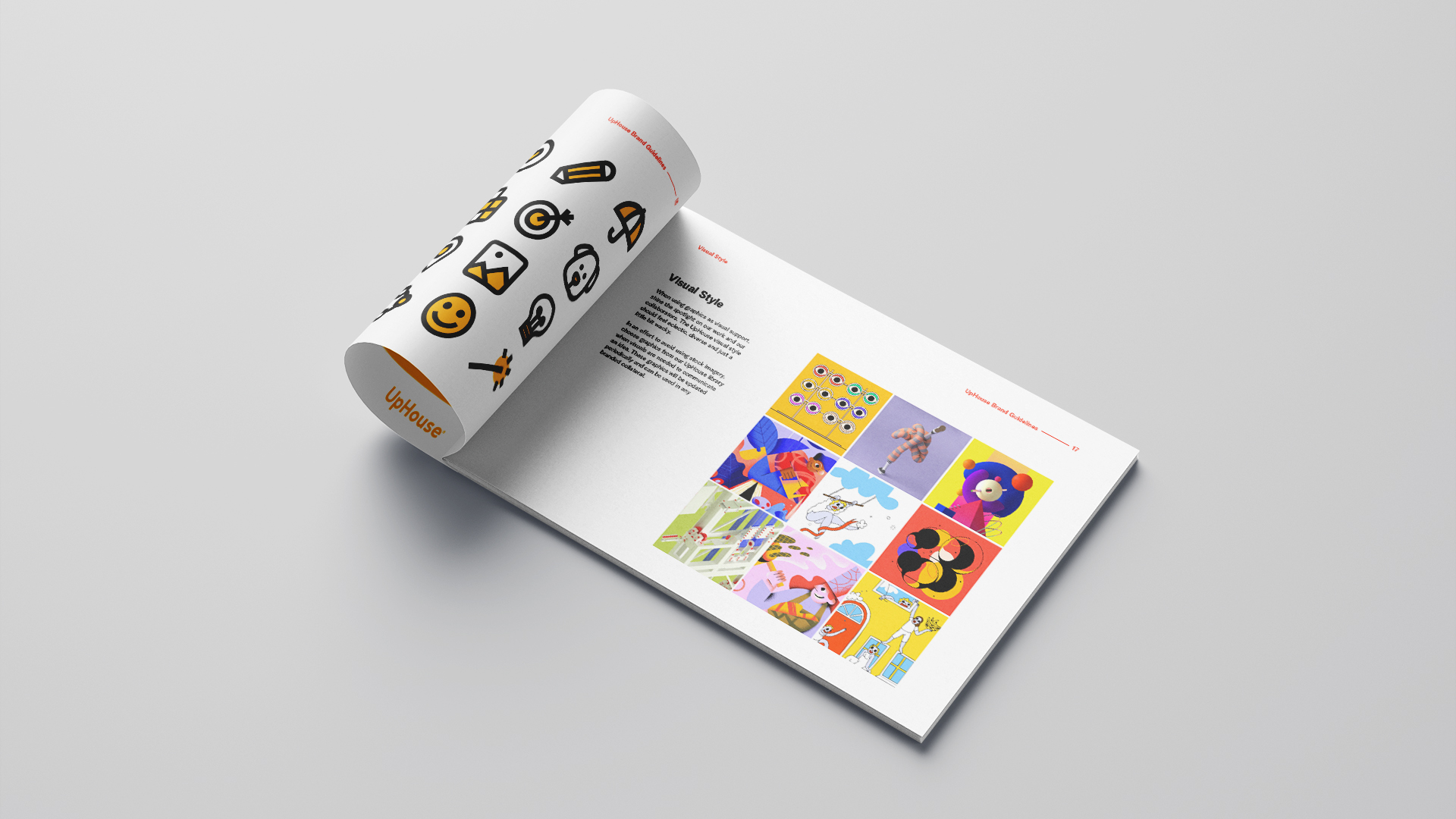
Your brand tool kit should make it easy for your marketing team to quickly create high-quality content that aligns with your brand voice and visual identity. As an agency that works with in-house marketers to strengthen their brands, we’re often tasked with crafting something creative and out-of-the-box, but with limited tools.
A client might say, ‘Do something different,’ but how can we do that if you only have two colours and a font from 1995? That’s tough. There are constraints for how we use these elements, but a good brand should allow for some freedom and creative interpretation. – Sheena Case
To make things easier for your marketing team, provide multiple complementary fonts and colours and clearly outline how you can and cannot use them. This will reduce guesswork and design mishaps. For example, you should select a font suited to 14pt or higher and an additional font for 14pt or lower.
When in Doubt, Get an Expert’s Opinion
We recommend performing a brand audit every five years to assess what’s working and what’s not and it never hurts to get a second set of eyes! If you’re not sure, just ask. You may not need a complete brand overhaul—especially if you have a well-defined, established brand. You might just need some more tools in your belt to provide better versatility and innovative ways to get your message out there.
Ready to put the wheels in motion on a brand refresh? We’d love to help. No matter how big or small your company may be, a solid brand identity can engage new customers, attract prospective employees, and set you apart from your competitors. What could be better than that?


