Understanding the Challenge
Health care can often be complex for this community: stigmas persist, negative experiences with the health care system can quickly break trust, and there can be a lack of access to health care providers who understand the needs of 2SGBQ+ men. In order to improve access to inclusive health care, the local CBRC team in Manitoba turned to us to develop a resource hub for 2SGBQ+ men.
Finding the Concept
It all starts with a name. When we work on any project like this, our goal is to develop a brand people are proud to engage with, and the right name is critical to brand identity.

What Happened Next?
With a standout name to guide us, we set out to develop the brand’s logo and visual identity. The client wanted a simple, clean look that would feel welcoming to all, but otherwise, they were open to anything. This meant our designers were able to experiment with a wide range of styles and concepts.

.
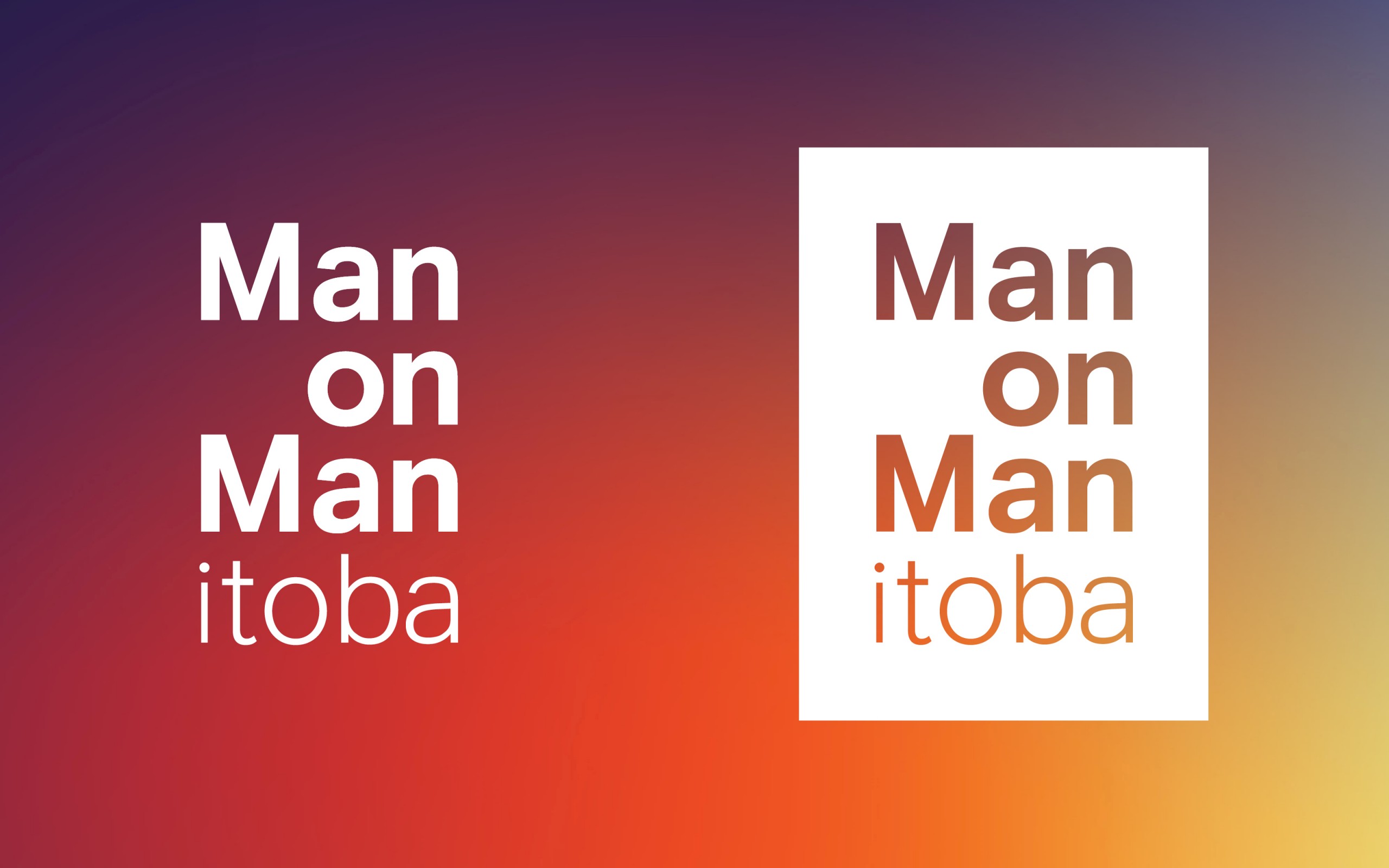
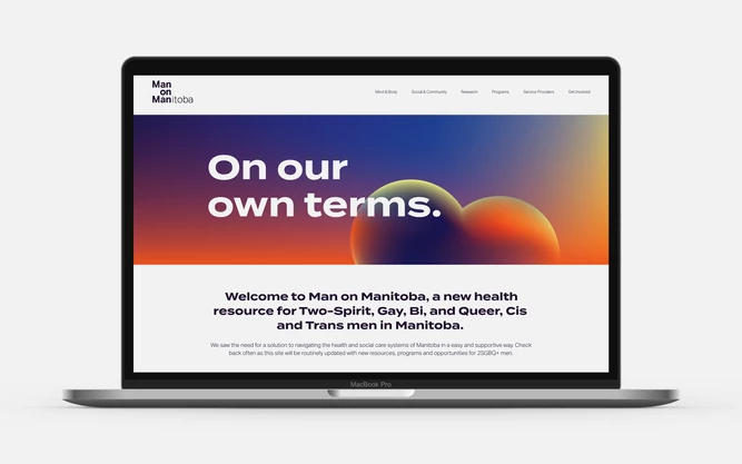
Ultimately, the client gravitated to the simplicity of a stacked text logo, with “Man on Man” emphasized to highlight the purpose of the website. To evoke the spirit of Pride while also keeping our colour palette neutral, we created a slightly muted gradient with yellow, orange, burgundy and a slightly washed-out navy. This was paired with abstract shapes that nod to the body —used in headers across the website and social media— and our gradient is used as an overlay on black-and-white photography for a cohesive brand look.
Bold and dynamic, Man on Manitoba is an exciting brand poised to bring 2SGBQ+ men together with critical health care resources.

Marketing Tips for In-House and Agency Marketers
- Engage community members. When you’re developing a brand or website that is going to support a community group, it’s vital to collaborate with members of the community to ensure you’re capturing their lived experience. The end result will be more authentic and your client can own the space more comfortably.
- Embrace collaboration. With such an open-ended brief, we were able to bring on a wide variety of people who came up with an incredible range of ideas. It pushed us to think about things in a different way, and the result is better for it.
- Do good. The opportunity to work on building something that brings direct value to a community is exciting and fulfilling.


