A number of answers come to mind when we consider the factors that make a brand premium. The most common, and quickest, answer is ‘higher price’ but a little soul searching discovers that the truest answer is more along the lines of exceptional quality, excellent and memorable service, exclusivity, and connecting a community around a shared passion.
The traits that make a brand premium may differ from brand to brand, but that doesn’t make one any less significant than the other. Any brand that enriches the buyer-seller relationship by bringing some special to the experience can opt for premium status.
So, how does a small business emulate the same premium feel of big premium brands, such as the likes of Apple or Nike? By taking a thoughtful approach and incorporating visuals that reflect the brand’s ongoing commitment to being the best in its product category.
Here’s a look at three very different brands, all of which define themselves as premium for different reasons.
Legacy Bowes
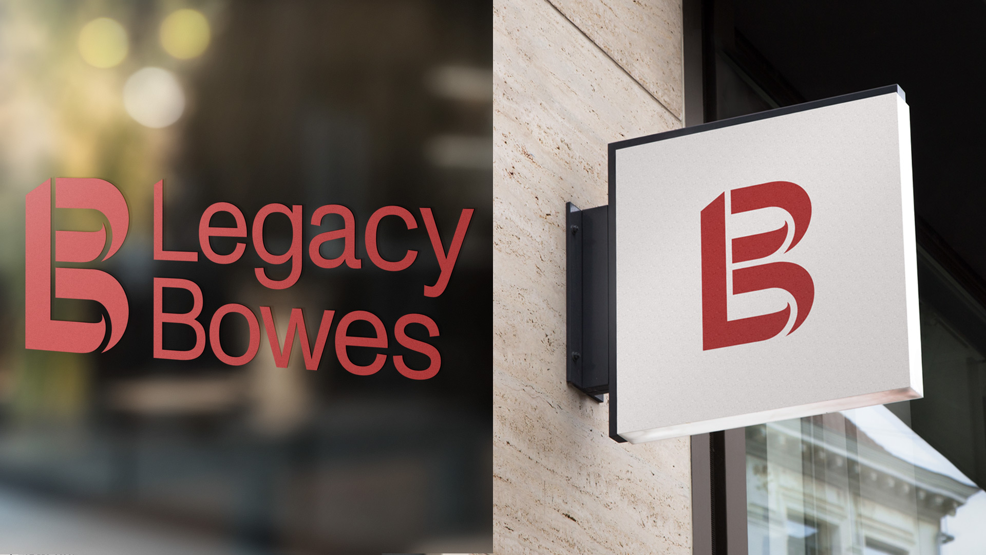
Legacy Bowes is a leading organizational consulting firm, offering career management, executive coaching, human resources advice, leadership training, and an executive search practice. Their austerity and gravitas stems from their elite offerings and shift to consultant-level partnerships. We tackled their premium-ness by adopting a minimalist approach and designing on a grid (which results in a functional and easy-to-digest design), choosing a typeface with little variation between letters (which gives a brand a more classic and luxurious feel), and using colours wisely (which greatly affects how a brand is perceived).

By only expressing the most necessary elements, this brand now very clearly expressed its message and what it’s all about
Cypress Craft
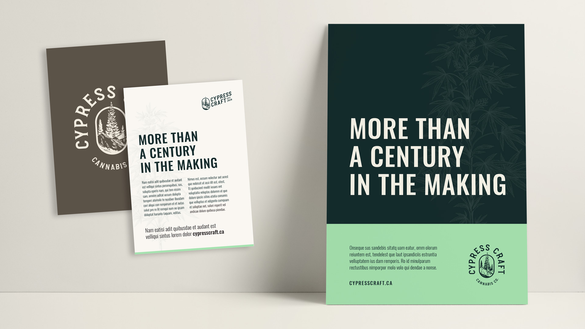
Cypress Craft is a small batch craft cannabis grower operating on a century-old farm where their family has been farming for generations. Their premium-ness comes from their nurturing care, attention to detail and love of growing crops. We approached their brand by leaning into their heritage and making tried, tested and true design decision.

This meant choosing rich colours that feel almost traditional and creating a badge-shaped logo featuring hills and trees. It reflects their geographic location and evokes feelings of quality, and it will stand the test of time.
Robinson
Robinson sells high-end lighting and plumbing fixtures. Their luxury aesthetic is rooted in the fact that they cater to a high-end customer. As a curator of fine products, they pride themselves on selling distinctive fixtures specifically for Canadian homes. Their premium-ness comes from the fact that the products they sell aren’t found in big box stores or large online retailers—they’re unique and allow homeowners to personalize their space. We used a clean, crisp, minimalist approach with their brand.

The Robinson brand is purposefully stoic to allow the quality and luxury of their products to take centre stage in marketing.
As a designer, the most important thing to remember when creating any brand visual is to start with a deep dive into what the business stands for and how it connect with customers. Doing so will ensure the final brand aesthetic connects with customers in an authentic way.


