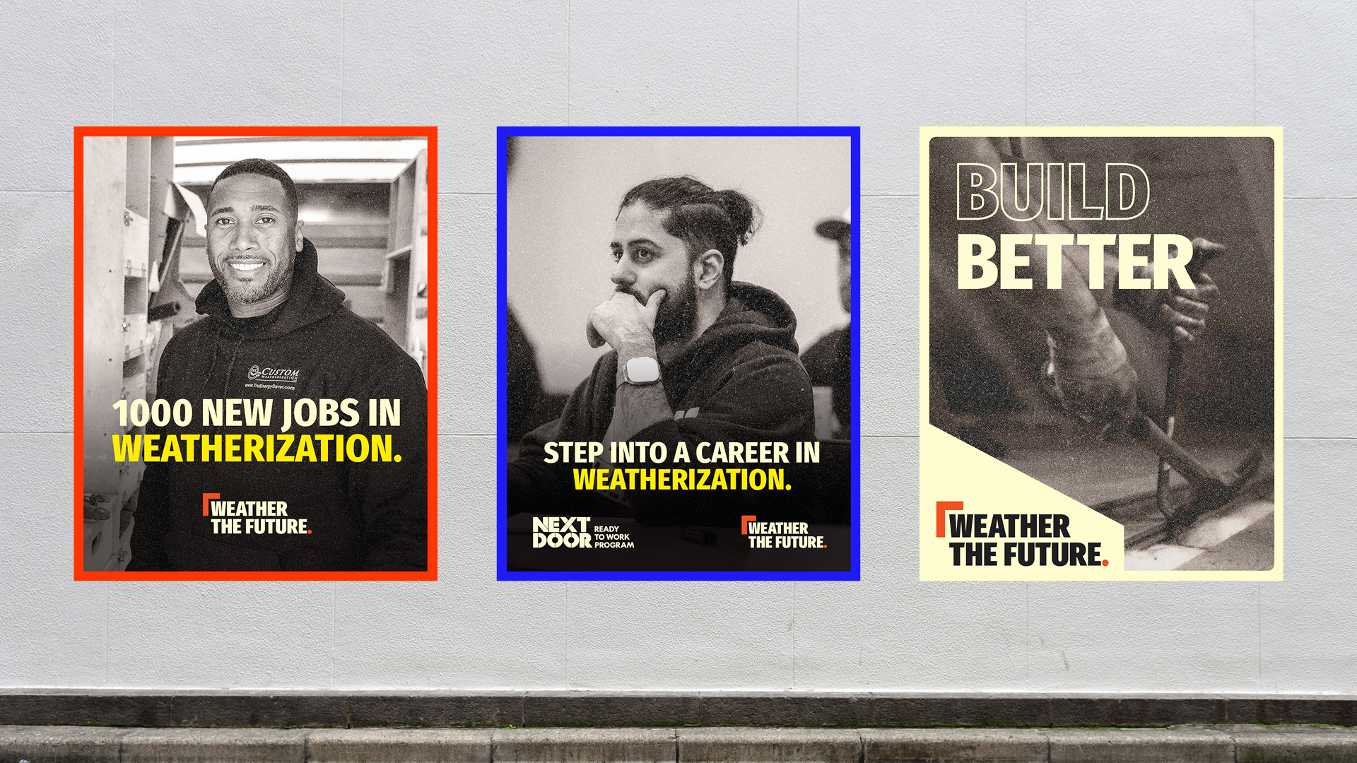
A great infographic has the power to take big ideas and make them accessible. A strong story, clear call to action and focused visual direction are critical to developing an effective infographic that will serve the client’s goals. Whether we’re highlighting the value of a product or service, or distilling a complex report into a digestible narrative, here’s how we design infographics.
Make Sure the Client Wants an Infographic
Many clients come to us wanting data visualization, which is pretty charts and graphics. Infographics tell a story. They drive results by using a visual or written narrative that leads to a clear call to action. Our process often starts with some level of strategizing to determine how the infographic will support a larger sales or marketing goal.
Discuss Where and How It Will Be Used
It’s also important at this stage to get a clear picture of how the client wants to use their infographic. Will it be attached to emails? Will it live on the client’s website? Knowing how and where it’s going to be used, and who’s going to see it, will determine the size and orientation of the infographic.
Discuss how the infographic can be repurposed. If a client wants to split the infographic up for a series of social media posts, we need to know how many posts they need so we make sure we have enough elements for them to work with. If it’s going on a website, the images need to be able to stand alone and the copy needs to be incorporated into the page or post so the content can be crawled by search engines.

Make a Crappy Drawing
Once we have client buy-in and understand the scope of use, we move on to working out the flow of information and the narrative arc with a rough drawing. We often encourage our designers and UI/UX designers to start their projects with a pen and paper drawing. It’s a fast, low-pressure way to organize your thoughts without feeling tempted to perfect a layout.
The next step is to flow the infographic copy into a wireframe – a nicer version of the drawing that we build in Adobe InDesign or XD. A wireframe will quickly tell you exactly how much copy you can fit in the infographic (hint: it’s often substantially less than a Word Doc will lead you to believe).

We always want our infographics to lead to a call to action, to drive the results that our clients are looking for, whether it’s boosting sales or making a substantial report digestible.
Create a Mood Board
As we’re working on the narrative arc, we also have a designer developing mood boards. We pull inspiration from all kinds of sources to show our clients the various ways we could approach the look and feel of their infographic. We find mood boards help us gather feedback from clients. Even if someone doesn’t know why they like or dislike a concept or element, a mood board gives them something to point to, and with questions, we can tease out why it works or doesn’t work for them.

.
We encourage clients to get feedback and buy-in from their team at this point. It’s easy to make changes to the wireframe and mood board to suit the desires of the team that will be using the infographic. It’s difficult to make changes to the fully-designed piece.
Design and Refine
With the wireframes as a guide for the flow, our designer gets to work illustrating the story we’re telling. Designers and writers collaborate closely in order to strike the right balance between words and visuals. Part of this process includes reducing copy, which can be a tough sacrifice for some businesses. But making sure the story is tight is critical to creating a great infographic that will deliver results.

Client Review and Revision
Once we’ve nailed the story and design, we present the infographic to the client for review. The client will often circulate the infographic for approvals from higher-ups. Ideally, the larger team already provided critical feedback at the wireframe and mood board stage, and only small revisions are required at this point.

.
The last step is to package the infographic for its various applications, such as web, social media, print or presentations. Infographics are time-consuming to create, but they’re rich in shareable nuggets of information. Distribute it on as many channels as possible.
7 Tips for Creating a Great Infographic:
- Take cues from the brand. Your client’s visual branding can help guide you toward styles that work for them. Pay attention to whether they use a lot of sharp angles or soft, fluid shapes, and let that inform at least some of your mood boards.
- Be bold. While you need to consider a brand’s visual identity, infographics are an opportunity for brands to get creative and deviate slightly from their visual branding – say, for example, by introducing a fun colour. As long as the foundation is on brand, it will work.
- Limit your colour palette. An infographic can begin to look like a hot mess very quickly if you’re not careful to limit the number of colours. While there’s no hard and fast rule, less is more when it comes to infographics.
- Get graphics from one source. If you’re using icons, illustrations or other visual elements from various sources, the line weights, angles, shapes and textures will vary, and the end result will feel unharmonious and unpolished. Working with a suite of graphics or creating your own is much more effective.
- Stick to your aesthetic. Once the client has approved an aesthetic, it’s vital that you stick to it and reign in any tendency to add new ideas. An infographic needs a tight story and a tight, refined look to be successful.
- Be consistent. Between visual elements and copy, there’s a lot going on in an infographic, so it’s important to treat elements consistently throughout. Using the same colours and font sizes on headlines, for example, creates harmony, making it easier for readers to take in the information.
- Establish a hierarchy of elements. While consistency is essential, it’s important to make sure you’re drawing attention to the information that matters most. Focus on that first and build the remaining elements around it.