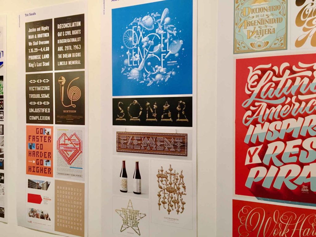
Tré Seals' work on display at the Ascenders 2018 Type Directors Club Exhibition (photo used with permission from TDC).
Can you describe your creative process? Where do you start, what do you usually have on or around you, how do you work?
I always start in my sketchbook. I sketch out everything that comes to mind, so I can get the bad ideas out of the way. Afterwards, I start researching: company history, the meaning of the name (i.e., the Latin root, or familial history of the name), competitors, and design research (to avoid trends and repetition). That usually means looking through old books, researching the industry and target audience, and more. All of this comes together to influence the final design.
Then it's back to sketching where concepts start to take shape. Once that's done, I jump on the computer and start designing the finished concepts.
Lastly – and this is kind of weird, but it works for me – whenever I'm working, I'm pretty much always listening to theme music from different movies. It's like a more intense version of jazz, but it keeps me focused.
Perhaps more than anyone, you've used art as therapy – it helped you through some very tough times including major surgeries, pain from a brain tumour and healing from this as a kid. Why do you think using art as a "coping mechanism" was so powerful for you?
Both times I had surgery, I was in the hospital for two weeks at a time. For a kid, that's a lifetime. And drawing made the time pass. It made me forget where I was, and that I was in pain, and that I was surrounded by children worse off than I was. And that pattern continues to today whenever times get tough, it helps me put things in perspective.
You're a multidisciplinary artist. What's your favourite medium, and why?
Hands down, type design. It's the one thing that involves everything that I enjoy about design: drawing, research, digital rendering, (on occasion) coding, and fewer time restrictions.
It's something I've been doing my whole life. In 5th grade, I would graffiti people's names on index cards and sell them for $3 a piece.
As a kid, you mostly developed your craft by drawing. What was the greatest skill you acquired or developed from attending Stevenson University School of Design?
The best gift they gave me was how to learn. I went to this seminar at Stevenson, and I don't remember anything else from that day, but (the speaker) said, "every class is a future client." I never saw a class the same again. I paid attention in every class, and while I wasn't the smartest at every subject, I understood the language. So now I can talk to and design for a sociologist, a psychologist, an engineer, an architect.
Tell us about the studio you built out of the former stable on your family's farm. Do you take breaks to pet animals or feed chickens? Did you tackle all the retrofitting yourself?
Hahaha. Unfortunately, we only had horses when I was growing up, until two years ago.
But, I do still feed the rabbits, and sit around watching the deer and the foxes roaming around the yard (and wild turkeys on occasion). We've got an eagle that hangs around too.
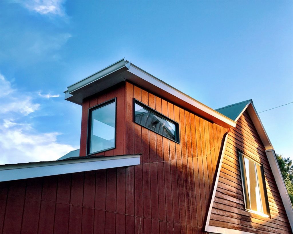
But the studio is built from what used to be stable, and it's over a hundred years old. It was built by my great great grandfather, and then sometime in the '70s, I think, my dad added a garage to the side of it. Thankfully I had a lot of help in the remodel. My only job was to pick things out and do the heavy lifting.
