“Once every two hours, a child in Manitoba is exposed to a police-reported incident of intimate partner violence.”
These are the sobering findings of a study conducted by the Manitoba Advocate for Children and Youth. The damage done to families by interpersonal violence is systemic and far-reaching, especially when it comes to its most vulnerable and often unseen victims—children.
Even beyond the trauma of witnessing these violent interactions firsthand, children can find themselves used as pawns in custody battles. They may be used as leverage, coerced into gathering information or even experience harm themselves.
After a 1995 inquiry into the murder-suicide of a Winnipeg couple, it became clear that there was a critical need for a service that could provide a secure place for parents and guardians to visit their children—a place that was safe for children and adults alike. This need led to the founding of the Winnipeg Children’s Access Agency (WCAA), an organization that provides supervised visits and exchanges for children with their parents or guardians in a protected facility.
Breathing New Life into a Sterile Visual Identity
Unfortunately, as is the case with many non-profits, WCAA’s visual identity didn’t reflect the value of their work. This issue affected their branding and the perception of their offerings among those they served. An organization like WCAA requires trust to succeed—from the courts, parents and, most importantly, the children themselves.
The outdated and institutional look evoked images of social workers and child protective agencies in the minds of their clients. These images justifiably bring up negative emotions in families, many of whom have dealt with unjust scrutiny, generational trauma or even cultural genocide at the hands of those same government agencies.
They knew it was time for an update—a refresh not just of their branding but also language, visuals and overall presence. They wanted to create an approachable and friendly brand for the families they serve, while coming across as modern and vibrant when speaking to the volunteers, donors, politicians and others who contribute to WCAA’s long-term success.
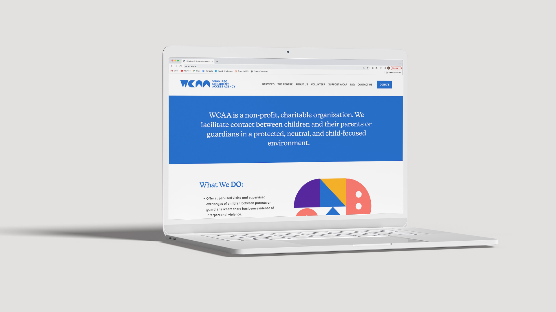
UpHouse helped rebuild the WCAA website from the ground up, rewriting and expanding the existing content using plain language and emphasizing intuitive and direct navigation. We took action to prioritize accessibility and avoid condescension, creating a positive experience for parents tired of battling excessive legalese to access the resources they and their families need.
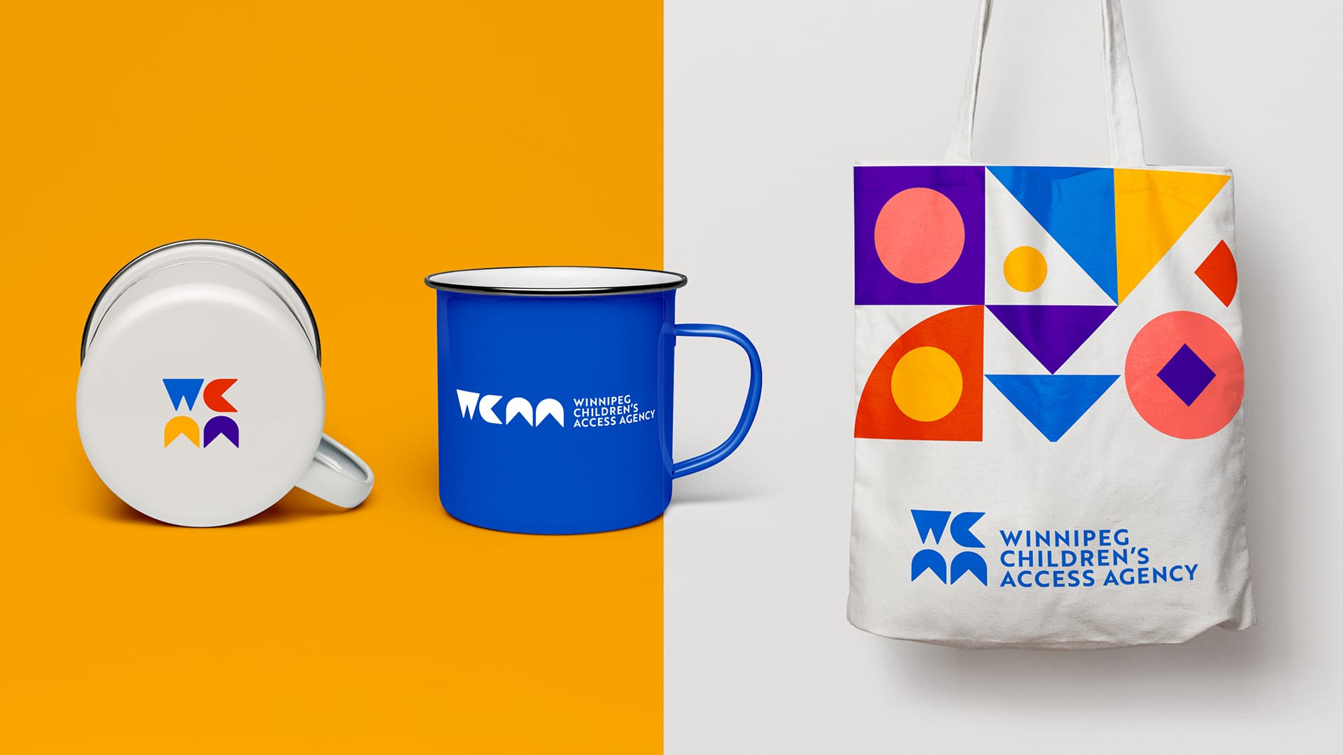
The redesigned logo and other visual themes are meant to call to mind children’s building blocks—both as a way to solidify WCAA’s place as a stable foundation on which guardians and children can rebuild and strengthen their relationships while also representing the opportunities for play and laughter offered to families within its walls.
The building block motif also offers modularity, allowing WCAA to speak flexibly to their diverse audiences without compromising brand recognition or redirecting its limited resources away from its most important goal: helping children.
3 Tips for Working with Non-Profits That Service Vulnerable Communities
Families seeking services from organizations like WCAA are experiencing substantial challenges and have likely endured a great deal of trauma. At the end of the day, our primary goal was to make it easier for them to access care and resolve conflicts, offering a sense of hope and a place of safety.
Here are some helpful tips for marketers to keep in mind when developing content for vulnerable populations.
1) Accessibility Matters
There are so many different aspects of accessibility that come into play when designing a website. For a service such as this one, it’s so important to make the website as easy to access as possible, so users won’t struggle to find the information they need. From writing copy in plain language to developing an intuitive UX and designing high-contrast visuals, taking the extra effort to make your website more accessible can make a world of difference for people of all backgrounds and abilities.
2) Explore Ways to Establish Trust
The cold, clinical vibe of WCAA’s former brand identity evoked negative feelings and perceptions in its users. Reinvigorating the brand identity helped to show people that this wasn’t a cold, clinical environment—rather, it’s a place of safety, progress, opportunity, stability, and growth.
Avoiding condescension was also incredibly important, as it upholds the user’s dignity and empowers them to seek assistance instead of feeling shamed or belittled. Removing jargon and sticking to plain language is another way of helping the user feel welcomed and supported. We recommend using an online text scanner to evaluate the “reading grade level” of your content. Typically, a reading level of Grade 8 or lower is ideal.
3) Ensure the Visual Identity Reflects the Offering
WCAA offers safety, progress, and peaceful resolutions, so they needed a brand identity that would capture that essence. If the website was all doom and gloom, it wouldn’t feel approachable or helpful for people who have endured family trauma. A sense of hope and optimism can go a long way, and you can convey this feeling through your brand’s colours, fonts, and overall visual identity. A lifeless, colourless brand can feel cold and unapproachable, and may bring to mind past negative experiences with other agencies or institutions.
Overall, we couldn’t be more pleased with how the website and visual assets turned out. Projects like these have the potential for such positive impacts on our community. By taking time to deeply understand and empathize with families facing such profound challenges, we were able to dismantle existing barriers and create something that makes accessing WCAA’s essential services much easier.

