Published On: December 16, 2020By
Legacy Bowes swirling brand pattern
Legacy Bowes Group began in 1984 and quickly grew into one of Winnipeg’s leading organizational consulting firms, offering career management, executive coaching, human resources advice, leadership training and an executive search practice. Recently, the firm was acquired by TIPI Insurance, Canada’s largest First Nations-owned insurance operation. And in early 2020, Legacy Bowes launched an exciting new endeavour—their TRC Call to Action 92 certification program for businesses.
With so many big changes, additional services and a growing customer base, the firm decided it was also the right time to refresh their brand.

Understanding the Challenge

The last time the company rebranded was in 2004. At that time, they adopted an indigo blue logo to convey integrity and sincerity. Since then, a number of competitors in the organizational consulting space had also adopted blue logos. As well, with the partial acquisition by TIPI Insurance, the firm wanted their branding to reflect that they were now part of a new family.
As is the challenge for many Indigenous-owned organizations or organization that serve Indigenous Peoples, they wanted their brand to reflect Indigenous culture without alienating non-Indigenous clients. And, they didn’t want a separate sub-brand for their Indigenous materials (something they had developed over time under their previous brand). Developing a new logo was a chance for the company to reintroduce themselves to all clients and talk about their business in a new way.

Finding the Concept

.
One of the first things we did was drop the word ‘Group’ from their name so that clients and partners would know them solely as Legacy Bowes and not be tempted to shorten their name to an acronym (which they didn’t want). We then set about distancing the company from the sea of industry competitors.
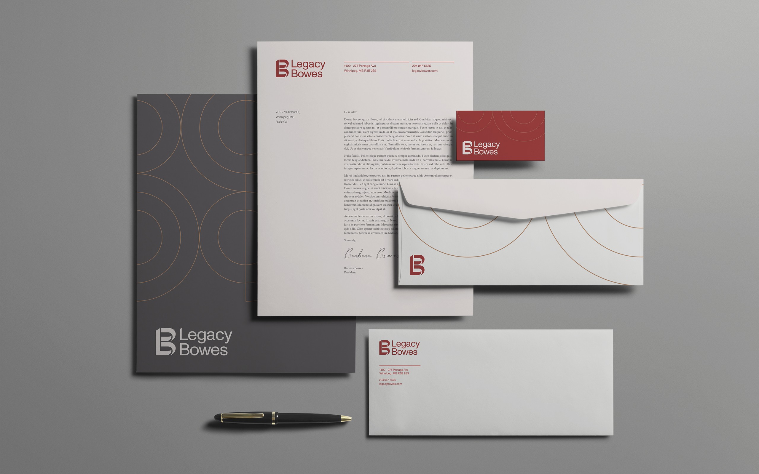
Legacy Bowes Stationary, including letterhead, envelopes and business cards.
 
The new Legacy Bowes brand features a red as its primary colour—a nod towards the dominant red in the Medicine Wheel but also a nod towards the red that is prominent within many other cultures in Canada. We deepened the read to a brick colour, giving the brand gravitas. From there, the rest of the colour palette fell into place—gold became our interpretation of the Medicine Wheel’s yellow, which automatically lends a premium feel, and a dark grey and warm grey stood in for black and white.
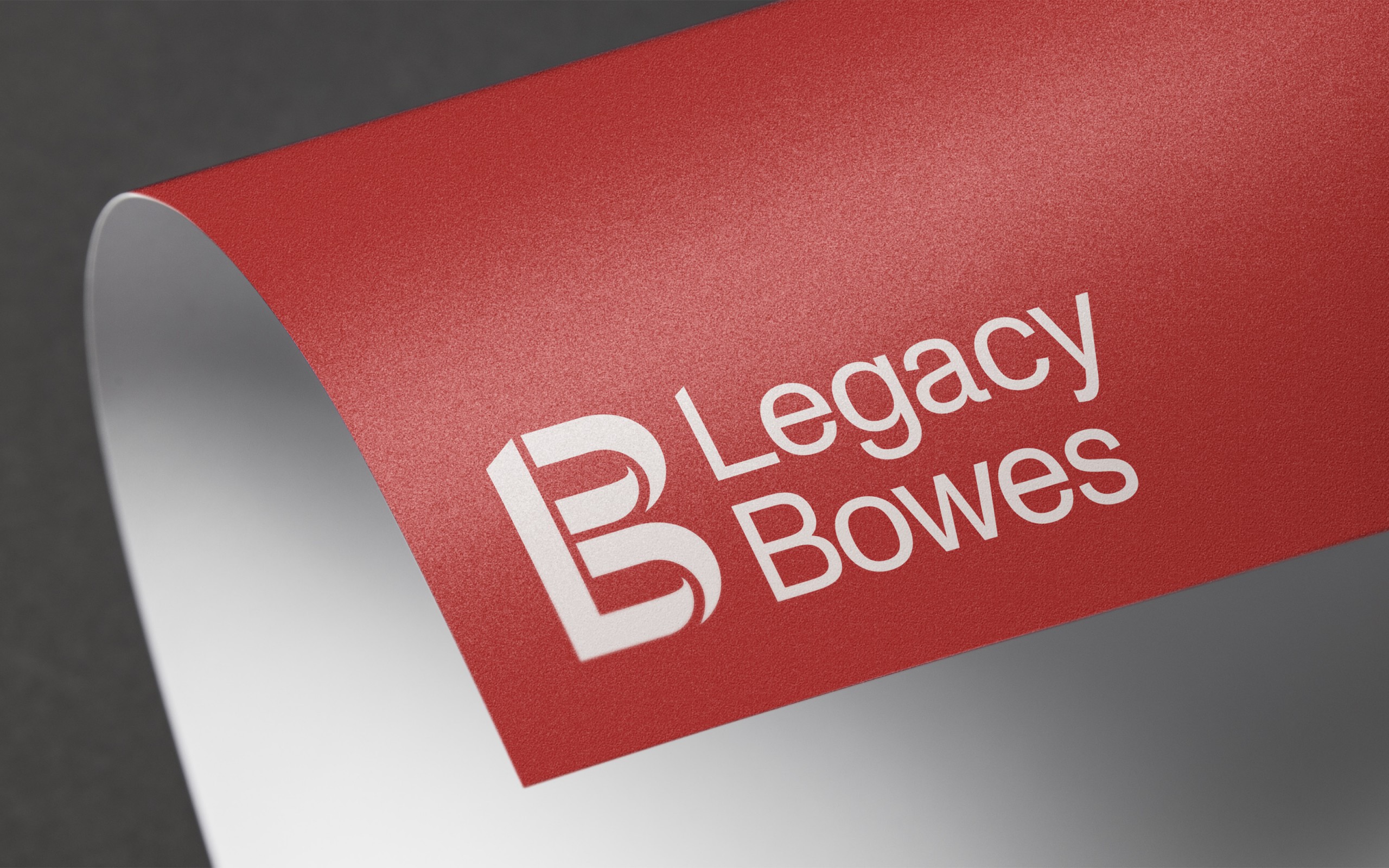
Legacy Bowes Logo
 
The brand features a classic wordmark and a monogram with flowing letterforms to create an ‘LB’. The four segments of the monogram represent the company’s four core areas of business: search and recruitment, leadership development, business advisory, and the new TRC Call to Action 92 certification.

What Happened Next?

The refreshed brand rolled out in February 2020 with an updated website, business cards and all new collateral. And while the logo may have changed, clients feel confident in knowing the company’s commitment to building long-term relationships through dedicated service remains the same.
Marketing Tips for In-House and Agency Teams
What’s the best way to update a brand to match its offering?
  1. Build a diverse network. As creatives, it’s important to bring in different and unique perspectives to every project. Think about who needs to form a relationship with the brand then reach out to your diverse network for feedback—not a stamp of approval but genuine feedback.
  2. Ensure the refreshed brand still reflects a company’s personality. Effective brands reflect a company’s style and tone. The biggest law firms and consultancies have an austerity to their branding. A brand’s marketing collateral needs to set the right expectations.
  3. Less is more to make a brand feel premium. Some brands use a minimalist approach to convey their premium status. When this is the case, only incorporate the most necessary elements and avoid the temptation to continually add to the branding or visual identity.